Comparative
This documentation shows how to use Comparative in Traveller Safety.
1. Access Comparative
-
Navigate to the Traveller Safety section and select the Comparative tab.
-
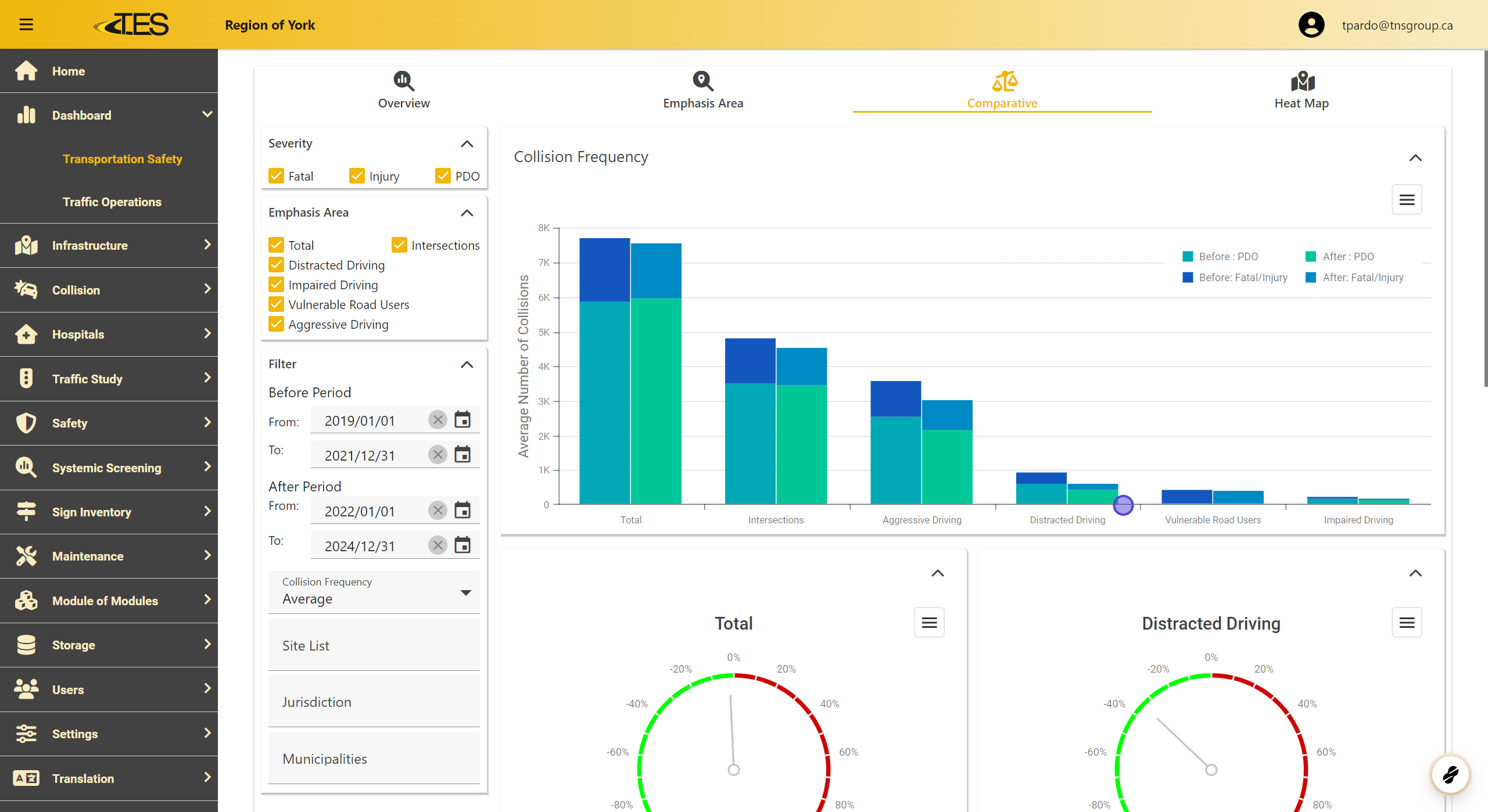
This section displays graphs comparing collision frequencies between an initial and a final time period.
-
Left Bars: Represent the initial collision frequencies for each emphasis area.
-
Right Bars: Represent the final collision frequencies.
-
-
Additional graphs below the main chart illustrate the percentage improvement in collision frequencies.
2. Exporting Graphs
-
Click the Hamburger Menu on any graph.
-
Select a format to export: PNG , JPEG , PDF , or SVG . This allows you to save and share the data visualizations easily.

3. Displaying Collision Frequencies
-
Customize the graph display by selecting or deselecting filters:
-
Severity: Choose from Fatal , Injury , or PDO (Property Damage Only).
-
Emphasis Area: Focus on specific areas like Distracted Driving , Intersections , or Aggressive Driving .
-

4. Adjusting Collision Frequency Type
-
Use the dropdown menu to toggle between:
-
Total Collision Frequency: Displays the total number of collisions.
-
Average Collision Frequency: Displays the average number of collisions for better comparison.
-

5. Adjusting Time Periods
-
Modify the time periods for comparison:
-
Before Period: Set the start and end dates for the initial time frame.
-
After Period: Set the start and end dates for the final time frame.
-
-
Use the calendar icons to specify exact dates or select from predefined ranges.

6. Filter Collision Frequencies by Location
-
Narrow down data based on specific areas:
-
Site List: Focus on particular sites.
-
Jurisdiction: Filter by regional boundaries.
-
Municipalities: Target specific municipalities for detailed analysis.
-
